Colour Makes a Comeback! New Trends From Maison & Objet
Author: Agnes Carpentier Date Posted:13 September 2019
Discover the biggest colour trends set to hit your home next year, direct from 2019's latest Maison & Objet in Paris
For a while now, we’ve been leaning on single colours, such as peacock blue or anthracite, to spice up a wall or a whole room. At the latest edition of the Maison & Objet trade fair in Paris, France, we saw a much more subtle use of colour, with multiple contrasting or harmonising hues played off against one another.
Since 1995, Maison & Objet has been the international meeting point for professionals in lifestyle, interiors and design. Twice a year, the show brings together more than 3,000 exhibiting brands and nearly 90,000 visitors, almost half of whom hail from beyond France’s borders. Houzz editors were at the Villepinte Exhibition Centre to find talent and identify tomorrow’s trends. Here are the eagerly awaited colour trends as we head into 2020.
1. The art of colour palettes
Of course, trendy and novel colours such as burnt orange, olive green and blood red were well represented. However, what we really noticed in the aisles of this September 2019 edition of Maison & Objet were the many colour palettes. There were very few monochrome booths: many featured subtle colour mixes based on triadic colour contrasts or analogous harmonies of three to five hues, combining primary and secondary colours.
A triadic colour contrast is comprised of any three colours that form an equilateral triangle on the colour wheel, such as the three primaries – blue, yellow and red, as seen in Piet Mondrian’s paintings. An analogous harmony refers to the combination of neighbouring colours on the colour wheel, such as wine red, burnt orange and blood red.
We are sure to start seeing some of these combinations on walls soon.
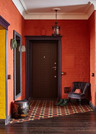
2. Warm harmonies with blood red, orange and mustard
These are clearly the novel hues for this year. Harmonies of warm and invigorating colours – burgundy, wine red, blood red, burnt orange, mustard and golden brown – create decor that’s sunny, energetic and perfect for re-enchanting our interiors.
Find an interior designer or decorator near you on Houzz to update your home with a contemporary colour palette
Francesca Pagliai Studio Fotografico
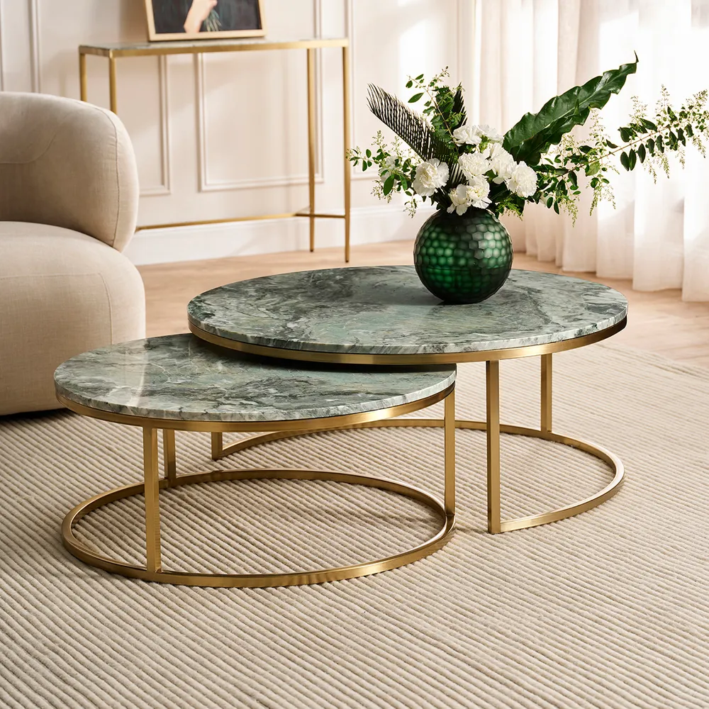
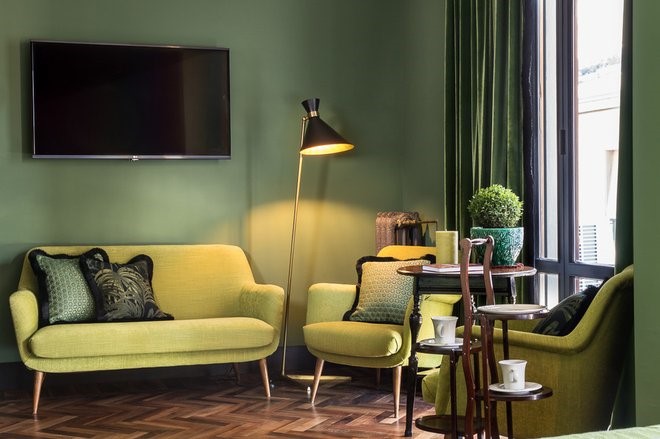
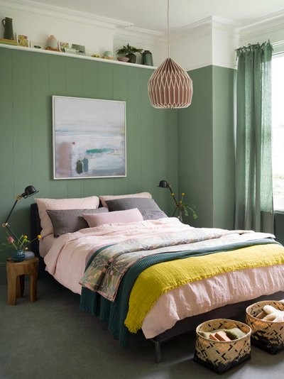
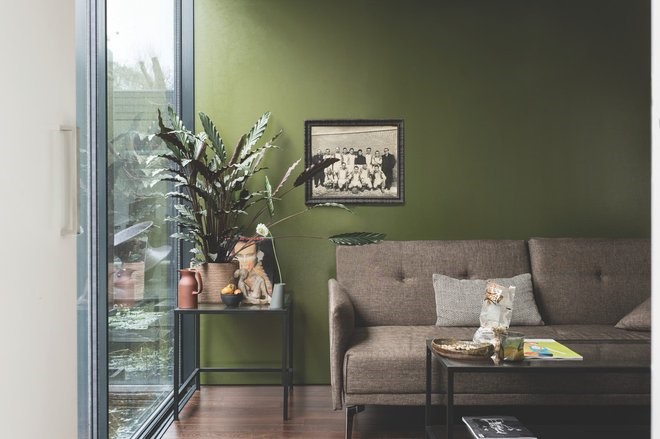
3. Cool combinations in khaki, yellow-green, linden and almond green
Among cool spectrums, it’s impossible to ignore the combination of shades of green. Fir green, the big colour of 2019, still appears here and there, while the new green on the block is tinged with yellow and tends towards a warmer khaki-olive.
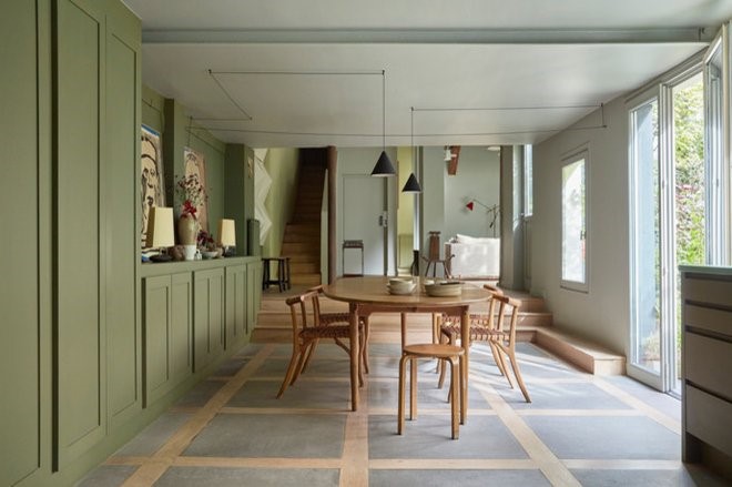
We also saw a lot of verdigris, linden and almond green that survived the Scandinavian era. A breath of nature is always welcome in our interiors.
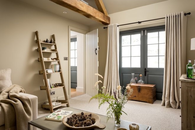
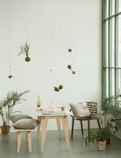
4. Sweet harmony in beige, taupe, greige, honey and fawn
These colours are, frankly, timeless classics rather than novelties. However, there’s no better way to spice them up than to combine multiple shades of these colours themselves: taupe (and onwards through the spectrum up to brown) has made a big comeback, and there are also shades of mustard yellow, fawn and sienna. These reassuring palettes make us want to cuddle up under a blanket.
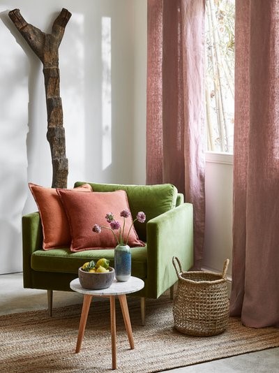
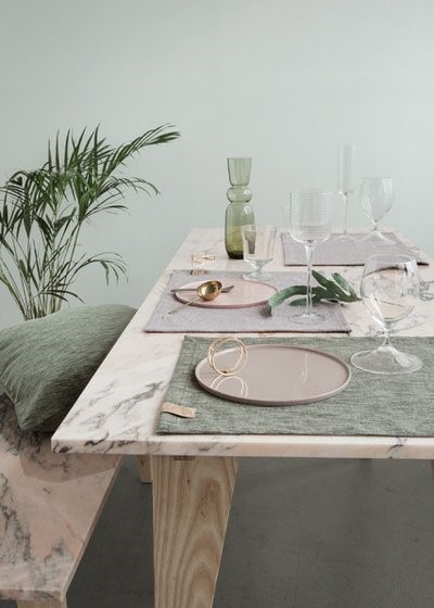
5. Spring contrast in khaki green, yellow green, pink, orange and sienna
This edition of Maison & Objet gave us the answer to a crucial question: which colours should I combine with khaki or olive green?
Opposites Attract: Complementary Colour Combos
For kicking these serene colours up a notch, nothing beats a powder pink, peach, coral or mustard: contrasting colours that add warmth without being overbearing, reminiscent of pretty flowers in a field. These colour schemes create an atmosphere inspired by nature and evoke spring cheer.
10 Trends for 2019 You Need to Know From Maison & Objet in Paris
.jpg)
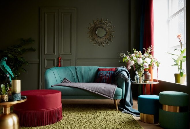
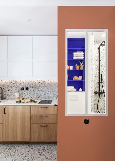
6. Classic chic contrast in bordeaux, blue-green, anthracite and beige
The bordeaux-green contrast needs to be treated with caution: easily slipping into a Christmas colour scheme, it changes its register when skilfully matched with olive, linden, peacock blue, anthracite or beige. When done right, it’s a surefire way to create a chic family home.
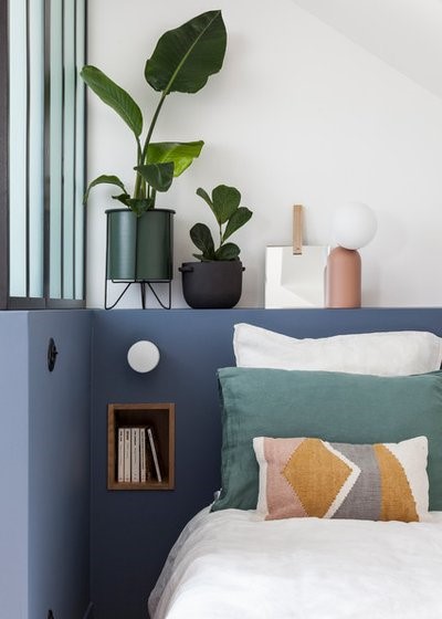
7. Delicate contrast in blue, orange and pink
Among blues, we’re seeing peacock blue, Klein blue and denim stepping into the limelight.
We’ve seen a lot of blue in the past few years, but now blues as a whole seem to be in sharp decline.
At this edition of the fair, we saw a more nuanced approach to blue with touches of pink, sienna and fawn – which form a less aggressive contrast than orange. It is a delicate evolution of the ethereal pink-blue duo that many of us have just seen too much of.
Meet Laura Gonzalez, Maison et Objet’s 2019 Designer of the Year
So You’re Tempted to Try Sage Green?
8. Two notes
Having spoken about colours and complementary shades, we would like to conclude with two observations.
First, matt, dull and earthy colours – manifestations of a renewed affirmation of our desire for nature – remain trendy.
Decorating With Tertiary Colours
In addition, the colour harmonies and contrasts we’ve discussed above work for dark and light colours alike: it’s up to you to choose anything from olive, orange and coral to almond green, powder pink and peach. Without a doubt, the future of our homes promises to be artistically colourful.
<div id="hzroot3148299" style="width:300px;text-align:center;font-size:12px;padding:0;border:0;margin:0;"><div style="font-size:14px;margin-bottom:3px;"><a href="https://www.houzz.com.au/magazine/maison-and-objet-the-colourways-you-need-to-know-about-stsetivw-vs~126517833" target="_blank">Colour Makes a Comeback! New Trends From Maison & Objet</a></div><div style="padding:0;margin:0;border:0;margin-bottom:3px;"><iframe data-hzvt="MjAxOTA5MTg6NDA4Mzp2aWV3R2FsbGVyeQ==" name="HouzzWidget4836616" id="HouzzWidget4836616" border=0 frameborder="0" SCROLLING=NO style="border:0 none;width:300px;height:275px;" src="https://www.houzz.com.au/jsGalleryWidget/gallery/126517833//new_window=yes/title_on=yes/width=300"></iframe></div></div>