The Golden Rules for a Balanced Colour Scheme
Author: Georgia Madden Date Posted:14 March 2018
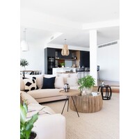
An interior designer shares the secrets to creating a beautifully cohesive colour scheme
A room with a well-balanced colour scheme feels calm, stylish and somehow right. But it’s not a look that happens by accident – creating a carefully considered space takes skill and an eye for detail. We spoke to Rohan Smith, senior interior designer at Coco Republic, to learn the tricks for choosing harmonious colours for your own home.
Email Save
Why does balance matter?
If everything in a room was competing to be the main feature, you wouldn’t know what look at. In a room with a balanced colour scheme, the stars of the show are more obvious. The walls will recede into the background and set the tone for other elements; the main pieces of furniture will stand out (without being overwhelming); and smaller pieces such as scatter cushions, artwork and decorative accessories will be the ones to really pop.
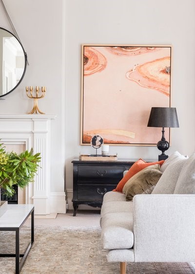
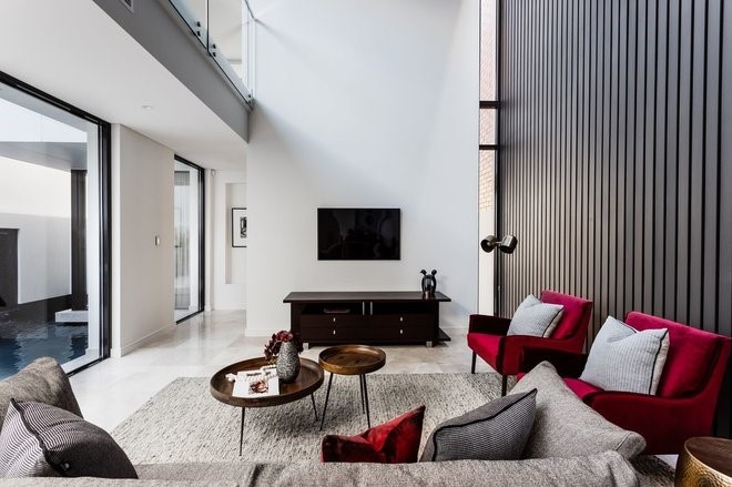
It’s also important the colours themselves balance and complement each other. If, for example, you have an artwork that consists mainly of warm reds and oranges, then using blues and greens in scatters and decorative accessories will provide visual interest as they are opposing colours on the colour wheel. If you prefer a less contrasting look, you could choose colours that sit next to red and orange on the colour wheel, such as yellows and violets.
Tip: A colour wheel can be a great tool to help you work out complementary colours. You can pick one up for a few dollars at most paint and hardware stores.
Email Save
When creating a balanced colour scheme, where should I begin?
Start by choosing the colour of the largest piece of furniture. For a sitting room, this would generally be the sofa or modular. Next, choose the colour of the rug and occasional chairs.
Last, choose the colours of smaller accent pieces, such as scatter cushions. If you’re looking to add personality and a touch of fun to your scheme, the smaller pieces are where to do it. They are easy and relatively inexpensive to swap out as tastes and trends change.
To create a sense of cohesion in your scheme, have a colour that links the various elements together. If I was introducing patterned scatter cushions, for example, I would then pick out one of the colours in the pattern and use it on a plain scatter cushion or a ceramic lamp base.
Tip: Picking out an obvious colour, such as a shade of blue to go with a predominantly blue-patterned scheme, would create a cosy feel. Alternatively, picking out a less obvious colour, or one that only appears in a small amount in the pattern, can add a sense of the unexpected to a scheme.
A Step-by-Step Guide to Perfecting Your Living-Room Layout
Email Save
What are some classic colour combos you love?
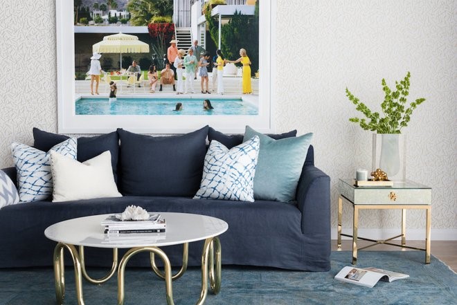
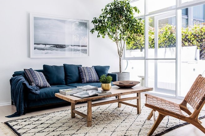
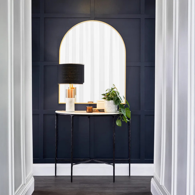
Right now, I’m loving all things navy. Navy and grey with touches of gold create a smart, contemporary scheme. Navy with white or ivory gives you a Hamptons or coastal look. Introducing coral or raspberry to a navy-based scheme can add a touch of fun.
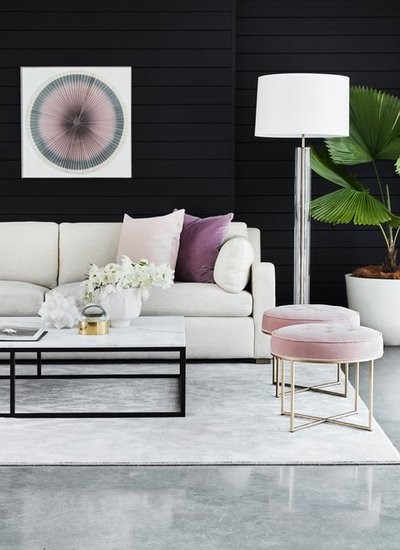
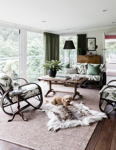
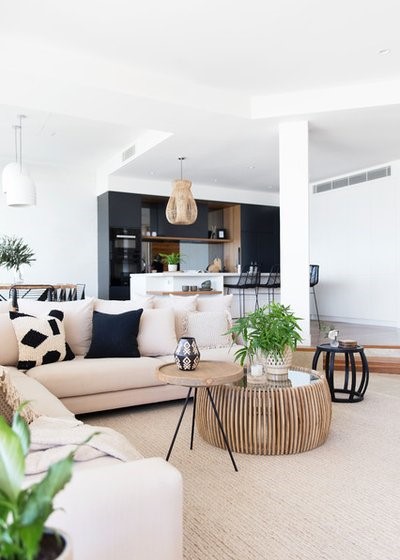
Naturals look great together and can be used in all sorts of settings. In a country setting, natural timber and rattan look relaxed and cosy. In a contemporary apartment, combining neutrals with brushed metal finishes and marble gives you a slick, sophisticated look.
Tan leather is a classic go-to addition to most colour schemes, adding warmth and texture.
Email Save
Is it a good idea to live with colours for a while before committing?
Yes, I can’t recommend this strongly enough. The colours of paint, furniture and window furnishings can be affected by many factors, including natural light, artificial light and the other shades in the room. It’s important to see any colours you’re considering at different times of day or night before you commit. A colour can look great in the warm, artificial light of a showroom but entirely different in the natural light of your home.
Borrow fabric swatches from the designer or furniture store, and pick up A4 cards painted with two coats of the paint you’re considering. Look at them at home under different light, and in different spots around the room.
Email Save
What is the 60:30:10 decorating rule?
It’s a timeless decorating principle that can help you create a balanced colour scheme. This guideline can be adapted in many ways. The 60 per cent could relate to wall and curtain colour; the 30 per cent could be the sofa; and the 10 per cent could be the scatter cushions. Or the 60 per cent could be sofa and carpet colour with the 30 per cent a feature wall colour.
And the percentages don’t just apply to fabrics and paint colours – they can apply to timber and stone finishes too. The possibilities are endless.
Email Save
- 60 per cent should be the main colour in a room. It anchors a space and provides a backdrop for the other colours. In a living room this would generally be the walls, sofas, rugs, carpet and window furnishings.
- 30 per cent is the secondary colour. It would encompass occasional chairs, bedlinen, window furnishings and occasional furniture. It should support the main colour, while being different enough to set it apart and give the room interest.
- The 10 per cent is your accent colour. For a living room, this would be scatter cushions, decorative accessories and artwork. For a bedroom, think throw pillows and artwork.
Email Save
Where does pattern feature in the 60:30:10 principle?
This really depends on the look you’re trying to create. If your sofa is fairly plain, you could add some pattern on a pair of occasional chairs. Or for a subtler look, you could add pattern on the scatter cushions. For a classic American look, you could add two or more patterns; a gorgeous plaid or check on occasional chairs with some paisley scatter cushions.
For a more dramatic look, you could use pattern for the 60 per cent proportion. A patterned wallpaper in a dining room would look incredible. The timber of a dining table would make up the 30 per cent and the fabric on the dining chairs the remaining 10 per cent.
Reno Reveal: What Australians Want From Their Kitchen Revamps
Email Save
I like a monochromatic look – how can I make it work with the 60:30:10 principle?
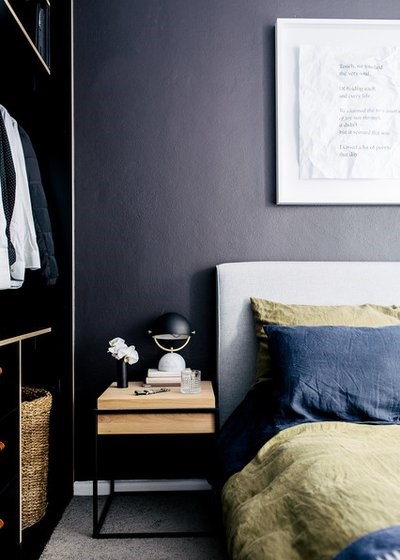
If you’re using just one colour in a room, I’d suggest varying the textures to add interest.
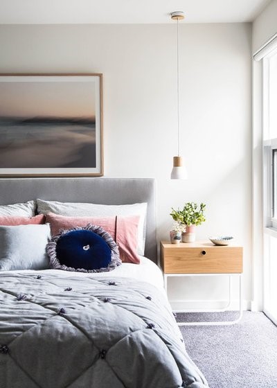
If, for example, you were decorating a bedroom in pale grey, the majority of the room could be wallpapered with a woven, pale-grey grasscloth wallpaper; the bedding could be pale-grey linen; and the bedhead could be upholstered in pale-grey mohair or velvet.
You would, in effect, still be applying the 60:30:10 principle, but with texture rather than colour.
Email Save
Is it best to use the same colour palette throughout the home or should you use different ones?
In today’s open-plan homes, it is best to stick to one colour combination throughout. These homes are designed to have an architectural flow, and using one colour scheme throughout adds to this fluid feel. If you’re looking to add personality to rooms, do so with small doses of accent colours.
Using different colour combinations in different rooms tends to work better in older homes where the rooms are more separate. Even so, I’d still recommend having one connecting colour running through the house, such as the colour on skirting boards, architraves and doors.
Browse more delightfully neutral living rooms
<div id="hzroot4310357" style="width:300px;text-align:center;font-size:12px;padding:0;border:0;margin:0;"><div style="font-size:14px;margin-bottom:3px;"><a href="https://www.houzz.com.au/magazine/the-golden-rules-for-a-balanced-colour-scheme-stsetivw-vs~96875788" target="_blank">The Golden Rules for a Balanced Colour Scheme</a></div><div style="padding:0;margin:0;border:0;margin-bottom:3px;"><iframe data-hzvt="MjAxOTEwMTU6NDA5Nzp2aWV3R2FsbGVyeQ==" name="HouzzWidget84404" id="HouzzWidget84404" border=0 frameborder="0" SCROLLING=NO style="border:0 none;width:300px;height:275px;" src="https://www.houzz.com.au/jsGalleryWidget/gallery/96875788//new_window=yes/title_on=yes/width=300"></iframe></div></div>


